The Range element is a user interface component commonly used in web forms to capture numeric input within a specified range.
Overview
Presented as a slider with a draggable thumb or handle, users can adjust the input value by moving the slider along a predefined scale.
The Range element is versatile, allowing users to select values within a minimum and maximum range, making it suitable for applications where precise numeric input is required. This can include settings like volume controls, numeric preferences, or any scenario where users need to input a numeric value within a specific range.
With its intuitive and interactive design, the Range element enhances the user experience by providing a visually clear and engaging way to input numeric data.
Example
Setup
The range element expects a default value. You can have single or multiple knobs for the range element.
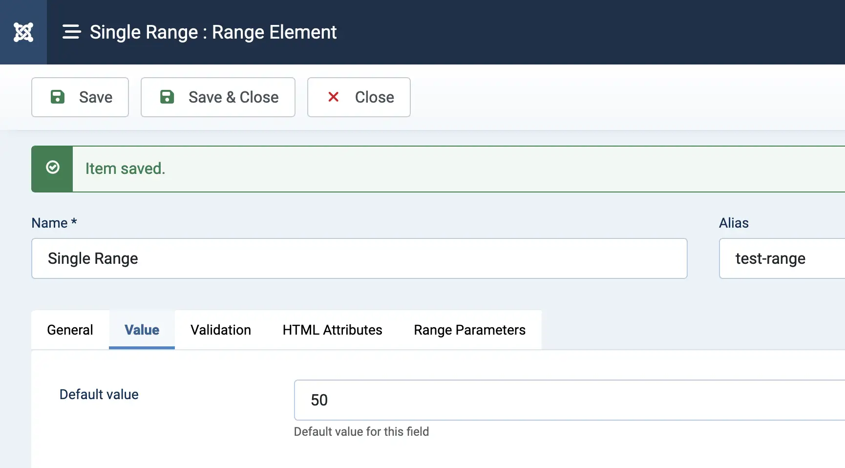
Single Value (Single knob)
Enter a default value in the value tab of the element creation page
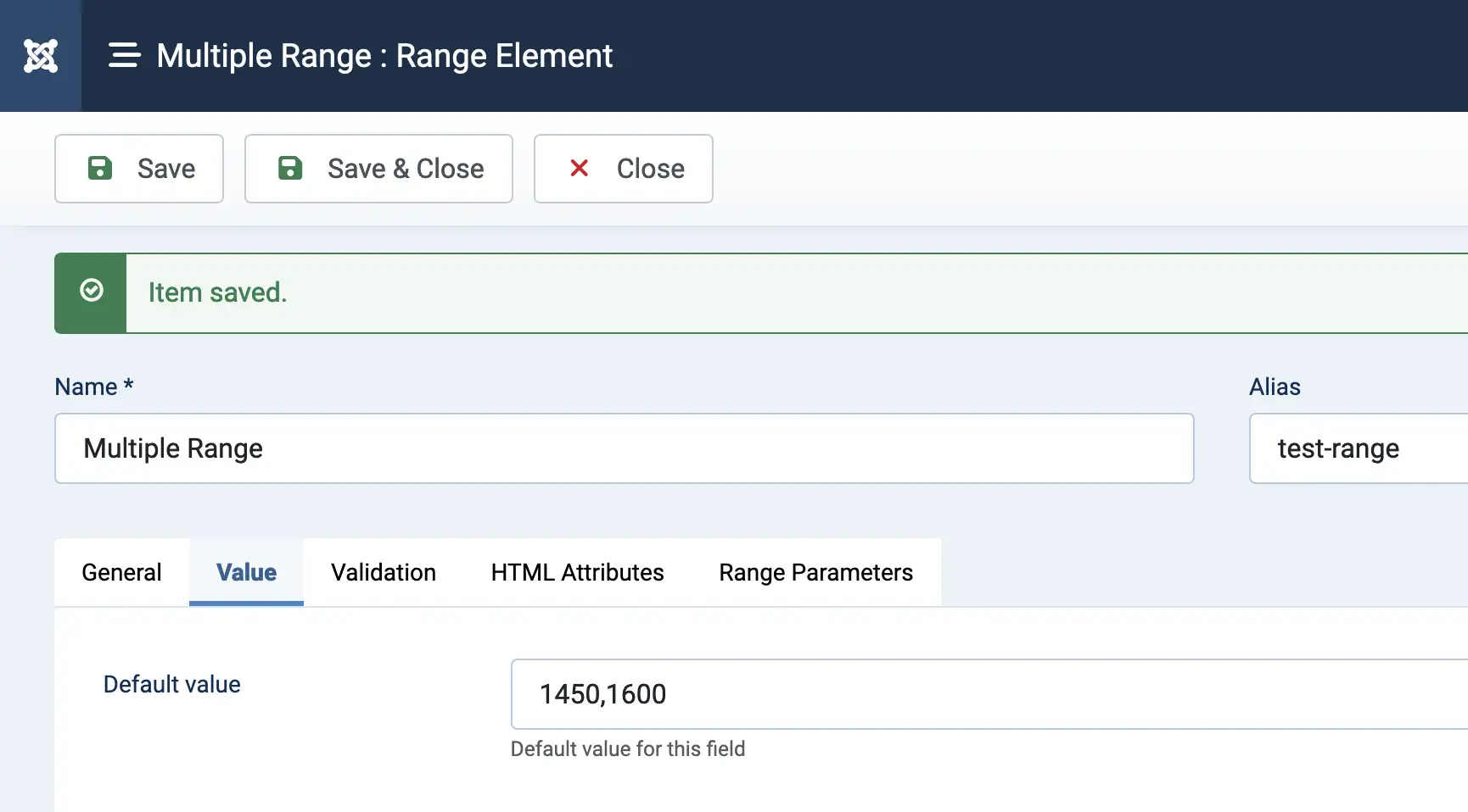
Multiple Values (Multiple knobs)
Enter a default values separated by a comma (,) in the value tab of the element creation page
The captured/stored user selected data for multiple values will be separated by a comma (,).
Parameters
Available parameters for Text Editor element
| Option | Description |
|---|---|
| Knob Style | The styling of the range knob. See example above to distinguish the differences between each style. |
| Use Custom Color | Enable custom color for the range track and selected range |
| Track color |
Option available when "Use Custom Color" is "Yes". The color for the track of the range |
| Selected range color |
Option available when "Use Custom Color" is "Yes". The color for the selected range |
| Min | The minimum value to where the slider could be slide |
| Max | The maximum value to where the slider could be slide |
| Step |
Refers to the interval or increment by which the slider value changes as the user interacts with it. This parameter determines the granularity of the values that can be selected on the slider. For example, if the step is set to 1, users can only select whole numbers on the slider. If set to 0.1, users can choose decimal values. |
| Margin | When using two handles, the minimum distance between the handles can be set using the margin option. The margin value is relative to the value of min and max |
| Limit | The limit option is the opposite of the margin option, limiting the maximum distance between two handles |
| Padding | Padding limits how close to the slider edges handles can be |
| Orientation | The slider orientation: Horizontal or vertical |
| Direction | The direction in relative to the min and max value |
| Enable Tooltip | Whether to show a tooltip of the selected value |
| Show tooltip only when dragging | Whether to show a tooltip only when the knob is being dragged |
| Decimal | Decimal place for the value |
| Decimal sign | If the value has a decimal, this parameters allows you to change the sign of the decimal |
| Thousand sign | The thousand separator. Default to a comma (,) |
| Suffix | Suffix to the value. For example, entering "%" will have the value be like 10% |
| Prefix | Prefix to the value. For example, entering "$" will have the value be like $10 |