The Switch element is a user interface component designed for toggling between two states—typically, an "on" and "off" position.
Overview
Also known as a toggle switch or a slider switch, this element provides a visually intuitive way for users to activate or deactivate a particular setting or option.
Physically resembling a small lever that can be moved horizontally, the Switch element visually conveys the current state by its position—either on or off. It is commonly used in settings menus, preference panels, or any scenario where users need a quick and straightforward method to enable or disable a feature.
The simplicity and clarity of the Switch element contribute to a user-friendly interface, making it easy for users to understand and control the activation of specific functionalities in applications or on websites.
Example
Create Switch element
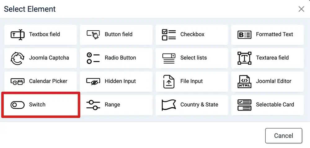
- Login to your Joomla! Administrator
- Go to Components » Formea Form Builder » Elements
- Click on the "Create Element" at the top
- Select "Switch"
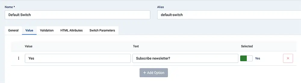
- Enter the generic field
- Enter the value in the "value" tab
- Configure the styling in "Switch Parameters" tab
- Save & Close
- Apply it in your form
Parameters
Available parameters for Switch element
| Option | Description |
|---|---|
| Size | The size of the switch. See example above. |
| Use Custom Color | Enable custom color for the switch |
| Unchecked Background | The background color for the unchecked/unselected switch |
| Unchecked Border | The border color for the unchecked/unselected switch |
| Checked Background | The background color for the checked/selected switch |
| Checked Border | The border color for the checked/selected switch |
| Error Background | The background color for the switch in a state of an error |
| Error border | The border color for the switch in a state of an error |