The Calendar Date & Time Picker element is a user interface component designed to facilitate the selection of both date and time in a convenient and user-friendly manner.
Overview
This element presents users with an interactive calendar interface for choosing a date, and an associated time picker for selecting the desired time.
Users can navigate through the calendar to pick a specific date, and the time picker allows them to set the desired time with precision. This element is commonly used in forms, booking systems, scheduling applications, and any scenario where capturing both date and time information is essential.
The Calendar Date & Time Picker enhances the user experience by providing a visually intuitive and efficient way to input temporal information, streamlining the process of selecting dates and times in applications and websites.
Example
Available placeholders
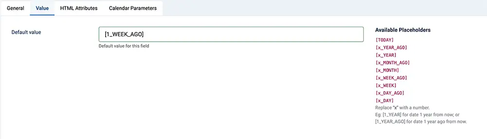
The placeholder serves as a dynamic value.
| Placeholder | Remarks |
|---|---|
[TODAY] |
Value will be replaced to the current date |
For the below placeholders, "x" is to be replaced with a number.
For example, replacing "x" to "1" for the placeholder [x_YEAR] like
[1_YEAR] will get the date 1 year from now;
or [1_YEAR_AGO] for date 1 year ago from now.
|
|
[x_YEAR_AGO] |
Value will be replaced to x year(s) ago |
[x_YEAR] |
Value will be replaced to x year(s) later |
[x_MONTH_AGO] |
Value will be replaced to x months(s) ago |
[x_MONTH] |
Value will be replaced to x months(s) later |
[x_WEEK_AGO] |
Value will be replaced to x week(s) ago |
[x_WEEK] |
Value will be replaced to x week(s) later |
[x_DAY_AGO] |
Value will be replaced to x day(s) ago |
[x_DAY] |
Value will be replaced to x day(s) later |
Formatting Tokens
Each character in the table below can be used to achieve the format you need for date and time
| Character | Description | Example |
| Date Formatting Tokens | ||
| d | Day of the month, 2 digits with leading zeros | 01 to 31 |
| D | A textual representation of a day | Mon through Sun |
| l (lowercase 'L') | A full textual representation of the day of the week | Sunday through Saturday |
| j | Day of the month without leading zeros | 1 to 31 |
| J | Day of the month without leading zeros and ordinal suffix | 1st, 2nd, to 31st |
| w | Numeric representation of the day of the week | 0 (for Sunday) through 6 (for Saturday) |
| W | Numeric representation of the week | 0 (first week of the year) through 52 (last week of the year) |
| F | A full textual representation of a month | January through December |
| m | Numeric representation of a month, with leading zero | 01 through 12 |
| n | Numeric representation of a month, without leading zeros | 1 through 12 |
| M | A short textual representation of a month | Jan through Dec |
| U | The number of seconds since the Unix Epoch | 1413704993 |
| y | A two digit representation of a year | 99 or 03 |
| Y | A full numeric representation of a year, 4 digits | 1999 or 2003 |
| Z | ISO Date format | 2017-03-04T01:23:43.000Z |
| Time Formatting Tokens | ||
| H | Hours (24 hours) | 00 to 23 |
| h | Hours | 1 to 12 |
| G | Hours, 2 digits with leading zeros | 1 to 12 |
| i | Minutes | 00 to 59 |
| S | Seconds, 2 digits | 00 to 59 |
| s | Seconds | 0, 1 to 59 |
| K | AM/PM | AM or PM |
Creating Calendar & Date time picker element
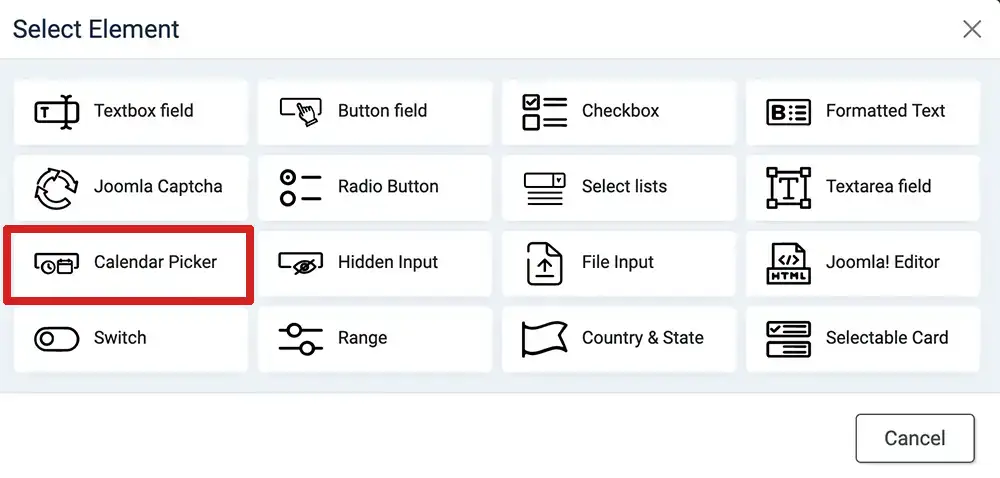
- Login to your Joomla! Administrator
- Go to Components » Formea Form Builder » Elements
- Click on the "Create Element" at the top
- Select "Calendar Pciker"
- Enter the generic field
- Enter the values in the "value" tab. For dynamic values, you can use the placeholder
- Configure the element in "Calendar Parameters" tab
- Save & Close
- Apply it in your form
Parameters
Available parameters for Selectable Card element
| Option | Description |
|---|---|
| Layout |
|
| Show Input Field | Will be available when "layout" is "inline". Show an input field above the calendar |
| Show Border | Will be available when "layout" is "inline". Wrapped element in border |
| Border Style | Will be available when "layout" is "inline". The style for the border around the inline calendar |
| Border Color | Will be available when "layout" is "inline". The color of the border around the inline calendar |
| Type | The mode of the element |
|
Date Picker Configuration
|
|
| Mode | The type of the calendar. |
| Min Date | The minimum date that can be selected in the calendar |
| Max Date | The maximum date that can be selected in the calendar |
| Date Format | How the date should be formatted |
| Custom Date Format | Refer the token above to achieve your desired date format |
| # of Months | The number of months to be shown at the same time when displaying the calendar. |
| Full width | Available when "# of Months" is 1. THis parameter let the calendar's width to fill the parent container |
| Disable dates | Option to disable (cannot be selected) dates by:
|
| Disabled date list |
Available when "Disable dates" is either "Disabling specific dates" or "Disabling all dates except" Comma (,) separated value of YYYY-MM-DD formatted dates. Eg: 2023-01-05, 2023-01-15 |
| Disabled date range list |
Available when "Disable dates" is either "Disabling a date range" Comma (,) separated value of YYYY-MM-DD ~ YYYY-MM-DD formatted dates, with tilde (~) to differentiate between the "From" date and the "To" date. Eg: 2023-01-05 ~ 2023-01-15, 2023-02-10 ~ 2023-02-20 |
|
Time Picker Configuration
|
|
| Time mode | Determine whether the time should be in 12 or 24 hour format |
| Hour Increment | Adjusts the step for the hour input (incl. scrolling) |
| Minute Increment | Adjusts the step for the minute input (incl. scrolling) |
| Enable Seconds | Enables seconds in the time picker. |
| Time Format | Despite the formatting tokens, "Seconds" will only appear if it's enabled |
| Custom Time Format | Refer to the formatting tokens above |