Give your forms some structure — from inline to horizontal to custom grid implementations — with our form layout builder options.
The layout builder is the main stage where you build the grids for your elements. It contain, pad, and align your elements.
It's based on the Bootstrap 12-grid system which are also used by Joomla!. Learn more about Bootstrap
Available options
Lists of all available options in the Form Layout section
-
New
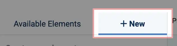 The "New" button, found here, provides you with the capability to generate a new element directly from within the Form creation page to be inserted inside the layout builder
 -
Available Elements
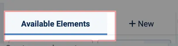 The "Available Elements" button, found here, displays a list of pre-existing elements. These elements can be chosen and inserted into the layout builder for restructuring the form.
 -
Preview Language Selector
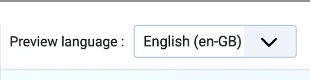 In the case of a multilingual website, this selector will display the label or caption of your elements in the language that has been chosen.
 -
Layout Type Selector
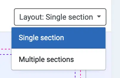
This option becomes accessible if you are subscribed to Formea Pro or possess a Core Extension of renderer type. It enables you to choose the layout type for your form:
Allows you to select the layout type of your form:
- Single Section: All elements are placed within a single section.
- Multiple Section: Elements are organized into multiple sections within your form, similar to using fieldsets.
-
Add Row
 Adding block of row with a predefined columns into the layout builder
Rows
Rows are wrappers for columns. Each column has horizontal padding (called a gutter) for controlling the space between them.
Adding rows
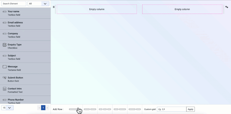
In addition to the pre-defined number of columns and sizes, you have the flexibility to include custom rows with
specific column sizes using the custom grid field. To do this, specify an integer (number) separated by commas to
indicate the column sizes, ensuring that they sum up to a total of 12. For instance, you can use
"7,5" to create two columns.
Row Settings
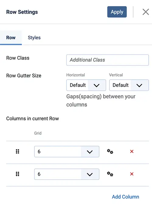
The row settings feature enables you to customize each row with distinct parameters and styles.
To access the row setting parameters:
- Click on the gears icon () on the right side of the row
- In the dropdown menu, click "
Edit Row"
| Options | Description |
|---|---|
| Row Class | You can specify an additional CSS class to be added to the row block, allowing for custom styling. |
| Row Gutter Size |
Gaps (spacing) between your columns. Horizontal: This determines the spacing between the left and right columns within the row. Vertical: It controls the spacing between the columns above and below the row. |
| Columns in current Row | This displays a list of the columns already added to the row. You can manage this list by sorting, removing, or editing each column. |
| Styles | You can configure styling options for the appearance of the row block. |
Sorting Rows
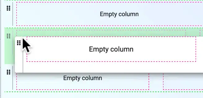
Click on the sorting icon (), and drag the row up, down or inside of a column to make a nested grid.
Removing Row
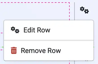
- Click on the gears icon () on the right side of the row
- In the dropdown menu, click "
Remove Row"
Columns
Columns are a grid block divided into 12 columns wrapped in a Row. You can use these columns to create different layouts by specifying the number of columns a particular element should span.
Adding Columns
As columns are subordinate to rows, you must access the 'Row Settings' to add/remove column. Here are the steps to do so:
- Locate the row where you wish to insert a new column and click on the gears icon () on the right side of the row.
- In the dropdown menu that appears, select "Edit Row."
-
Within the "
Columns in Current Row" section:Add New
Click the "Add Column" button situated at the bottom of the section. This will allow you to add a new column to the row.Remove
Click the button situated on the right side of the column in the column lists. This will remove the column in the row. - Click "
Apply" at the top
Sorting Columns
Continuation from the step above, in the "Columns in Current Row" of the "Row Setting",
click on the sorting icon () on the left side of the column list, and drag the row up, down.
Column Settings
The column settings feature enables you to customize each column with distinct parameters and styles.
To access the column setting parameters:
- Click on the
pinkvertical ellipsis icon () on the right side of the column - In the dropdown menu, click "
Edit Column"
| Options | Description |
|---|---|
| Column Class | You can specify an additional CSS class to be added to the column block, allowing for custom styling. |
| Grid | The size of the column in which element shall span |
| Element in column | This displays a list of elements in the columns |
| Styles | You can configure styling options for the appearance of the column block. |
Adding element to layout
Incorporating elements into the layout builder is straightforward. You can either click on an element from your "Available Elements" list or opt to create a "new" element, which will be automatically inserted into the layout.
Creating new element
To create a new element, follow these steps:
- Click on the "New" tab, which will present a list of installed element types.
- Select the element type you wish to create.
- A pop-up modal will appear. Depending on the element type, fill in the required parameters.
Learn more about Elements - Click "Save & Close."
- The newly created element will become visible in the layout builder, allowing you to arrange it within the form structure. Additionally, the newly created element will be listed among the "Available Elements" for future use.
Existing element
To utilize an existing element, adhere to these steps:
-
Click on "Available Elements," which will display a comprehensive list of all previously created elements.
You can employ filters by type or utilize the search input to locate your desired element.
If you have a substantial number of elements, you can use the pagination at the bottom to increase the displayed elements or navigate to the next page of element listings.
- Select the element you wish to insert into the layout.
- The chosen element will become visible in the layout builder, enabling you to position and arrange it within the form structure.
Arranging element
Drag the element to a column to arrange or position it
Label/Caption
Block Styling
You have the ability to style the appearance of each row, column, and element. This includes options such as changing the background color, adding spacing, or borders to emphasize specific sections of the form, thereby giving them a unique and distinctive appearance.